
Grayscale as an Emotive Palette
While not a hard science, there is a wealth of theory surrounding the psychology of color. Many suggest that black and white images give the viewer a sense of nostalgia. This is in part due to the history and original capabilities of image making and photography. However, the color range of an image goes beyond technological limitations. A smaller tonal palette gives an author the ability to communicate an idea through the contrasts, nuances and subtle tone shifts that might go unnoticed in a full-color image. While film and photography were initially black and white due to limitations of the time today it is regarded as a technique that in many cases preferred today. This is not to say that color images are lesser but that they tell a different version of the same story.
“When you photograph people in color, you photograph their clothes. But when you photograph people in Black and white, you photograph their souls!”
– Ted Grant
The same could be said of a space, a building, or a landscape.
One should not see using a limited palette as muting an image. Rather, it provides a different set of tools to edit and image to express an idea. For example contrast can be adjusted with a greater visual strength and conversely subtle tonal shifts are noticeable in a grayscale image where that would otherwise be the case in a saturated color image. Black and white imagery has secured itself as a staple in the photography culture
“Nonsense: black and white is its own distinct aesthetic endeavour; there are things that can be done with tone, grain and contrast that are simply impossible – or, at least, far less satisfying – in colour photography.”
-John Patterson, The Guardian
For the same reasons black and white imagery is a convention used by many other disciplines.
Sparing use of color quickly distinguishes shifts in time and place. In photography, film and digital image making the grayscale palette faces contention stating that it can be seen as an artistic choice employed in situations when it does little in portraying the story of the subject. A quote written about the film Schindler’s List makes and interesting point that mages in a different color palette can suggest an alternate and realistic view of subject to a viewer.
“Although contemporary viewers are accustomed to full-color images and tend to consider such images to be more realistic than those in black and white, the black and white in Schindler’s List conveys an alternate but no less realistic version of life. “
I’ve said all of this to say that in telling the story America Street- Baton Rouge, Louisiana a limited color palette was the technique I chose to show an audience a familiar street, a common story through a new lens. The grayscale palette reinforces the austerity of the situation, the history of the place and the importance of the crumbling sidewalk and decaying buildings rather than the color of them. Quite literally the palette represents the black and white problem of fragmented landscape planning, and the so-called gray area in which many of our neighborhoods have been cast into rather than appropriately dealt with. Beyond metaphor and analogy sparing use of color quickly distinguishes shifts in time and importance. The vision noise and distraction color can lend to an image has been distilled and the narrative images are opened to a variety of tonal contrasts and a versatility of later layers of information. In this particular triptych color then can mean something specific since I have chosen when and where it appears. The introduction of color in later iterations of the image will then suggest that something has changed, most likely time or the state of affairs in the neighborhood.
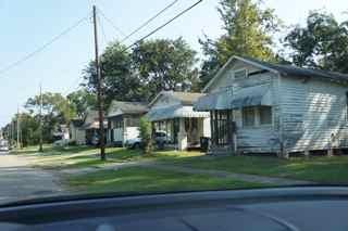
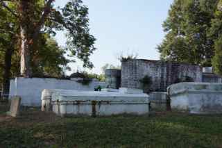
These original images (as well as others) come together to tell the story of the vertical segmentation of the horizontal landscape and the results of such situations. Pictured below